
Search results for "Start weighting" in Home Design Ideas
 SALA Architects
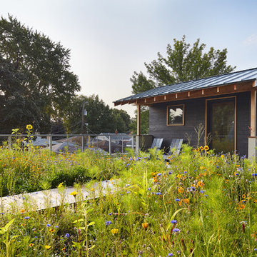
The industrious clients came to us with dreams of a new garage structure to provide a home for all of their passions. The design came together around a three car garage with room for a micro-brewery, workshop and bicycle storage – all attached to the house via a new three season porch – and a native prairie landscape and sauna structure on the roof.
Designed by Jody McGuire
Photographed by Corey Gaffer
 thea home inc
Tessa Neustadt
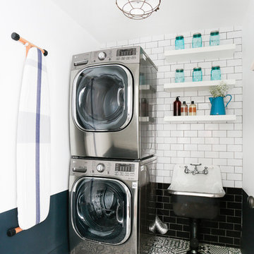
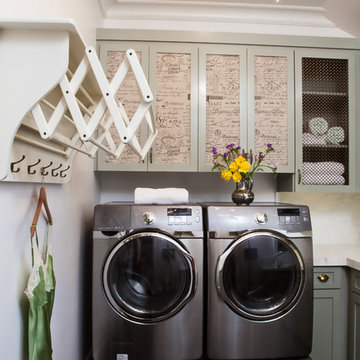
Transitional multicolored floor dedicated laundry room photo in Los Angeles with open cabinets, white cabinets, multicolored walls and a stacked washer/dryer
Transitional multicolored floor dedicated laundry room photo in Los Angeles with open cabinets, white cabinets, multicolored walls and a stacked washer/dryer
 TKS Design Group
Free ebook, Creating the Ideal Kitchen. DOWNLOAD NOW
Our clients and their three teenage kids had outgrown the footprint of their existing home and felt they needed some space to spread out. They came in with a couple of sets of drawings from different architects that were not quite what they were looking for, so we set out to really listen and try to provide a design that would meet their objectives given what the space could offer.
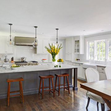
We started by agreeing that a bump out was the best way to go and then decided on the size and the floor plan locations of the mudroom, powder room and butler pantry which were all part of the project. We also planned for an eat-in banquette that is neatly tucked into the corner and surrounded by windows providing a lovely spot for daily meals.
The kitchen itself is L-shaped with the refrigerator and range along one wall, and the new sink along the exterior wall with a large window overlooking the backyard. A large island, with seating for five, houses a prep sink and microwave. A new opening space between the kitchen and dining room includes a butler pantry/bar in one section and a large kitchen pantry in the other. Through the door to the left of the main sink is access to the new mudroom and powder room and existing attached garage.
White inset cabinets, quartzite countertops, subway tile and nickel accents provide a traditional feel. The gray island is a needed contrast to the dark wood flooring. Last but not least, professional appliances provide the tools of the trade needed to make this one hardworking kitchen.
Designed by: Susan Klimala, CKD, CBD
Photography by: Mike Kaskel
For more information on kitchen and bath design ideas go to: www.kitchenstudio-ge.com
Find the right local pro for your project
 Thyme & Place Design LLC
When my client had to move from her company office to work at home, she set up in the dining room. Despite her best efforts, this was not the long-term solution she was looking for. My client realized she needed a dedicated space not on the main floor of the home. On one hand, having your office space right next to the kitchen is handy. On the other hand, it made separating work and home life was not that easy.
The house was a ranch. In essence, the basement would run entire length of the home. As we came down the steps, we entered a time capsule. The house was built in the 1950’s. The walls were covered with original knotty pine paneling. There was a wood burning fireplace and considering this was a basement, high ceilings. In addition, there was everything her family could not store at their own homes. As we wound though the space, I though “wow this has potential”, Eventually, after walking through the laundry room we came to a small nicely lit room. This would be the office.
My client looked at me and asked what I thought. Undoubtedly, I said, this can be a great workspace, but do you really want to walk through this basement and laundry to get here? Without reservation, my client said where do we start?
Once the design was in place, we started the renovation. The knotty pine paneling had to go. Specifically, to add some insulation and control the dampness and humidity. The laundry room wall was relocated to create a hallway to the office.
At the far end of the room, we designated a workout zone. Weights, mats, exercise bike and television are at the ready for morning or afternoon workouts. The space can be concealed by a folding screen for party time. Doors to an old closet under the stairs were relocated to the workout area for hidden storage. Now we had nice wall for a beautiful console and mirror for storage and serving during parties.
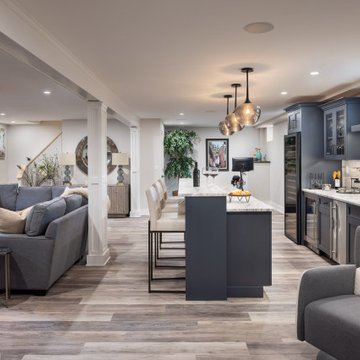
In order to add architectural details, we covered the old ugly support columns with simple recessed millwork panels. This detail created a visual division between the bar area and the seating area in front of the fireplace. The old red brick on the fireplace surround was replaced with stack stone. A mantle was made from reclaimed wood. Additional reclaimed wood floating shelves left and right of the fireplace provides decorative display while maintaining a rustic element balancing the copper end table and leather swivel rocker.
We found an amazing rug which tied all of the colors together further defining the gathering space. Russet and burnt orange became the accent color unifying each space. With a bit of whimsy, a rather unusual light fixture which looks like roots from a tree growing through the ceiling is a conversation piece.
The office space is quite and removed from the main part of the basement. There is a desk large enough for multiple screens, a small bookcase holding office supplies and a comfortable chair for conference calls. Because working from home requires many online meetings, we added a shiplap wall painted in Hale Navy to contrast with the orange fabric on the chair. We finished the décor with a painting from my client’s father. This is the background online visitors will see.
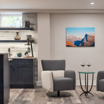
The last and best part of the renovation is the beautiful bar. My client is an avid collector of wine. She already had the EuroCave refrigerator, so I incorporated it into the design. The cabinets are painted Temptation Grey from Benjamin Moore. The counter tops are my favorite hard working quartzite Brown Fantasy. The backsplash is a combination of rustic wood and old tin ceiling like porcelain tiles. Together with the textures of the reclaimed wood and hide poofs balanced against the smooth finish of the cabinets, we created a comfortable luxury for relaxing.
There is ample storage for bottles, cans, glasses, and anything else you can think of for a great party. In addition to the wine storage, we incorporated a beverage refrigerator, an ice maker, and a sink. Floating shelves with integrated lighting illuminate the back bar. The raised height of the front bar provides the perfect wine tasting and paring spot. I especially love the pendant lights which look like wine glasses.
Finally, I selected carpet for the stairs and office. It is perfect for noise reduction. Meanwhile for the overall flooring, I specifically selected a high-performance vinyl plank floor. We often use this product as it is perfect to install on a concrete floor. It is soft to walk on, easy to clean and does not reduce the overall height of the space.
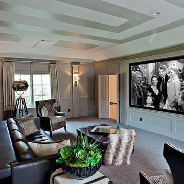
 H. Customs Audio Video
2013 Fort Worth Dream Home
Built by AG Builders, Featured in Fort Worth Magazine and Electronics design/installation performed by H. Customs Audio Video.
This media room features a 120" projection screen, 3 Episode Front Stage In-Wall Speakers, 4 - 8" In-Ceiling Surround Speakers, Episode Triple 10" Subwoofers, Onkyo Surround Sound Receiver, SnapAV Matrix Switcher, Bluray DVD, AppleTV, Custom Rack.
Design by H. Customs Audio Video and AG Builders
Entire home is Control4 automated.
For more information please contact H. Customs.
Photography by Fort Worth Magazine
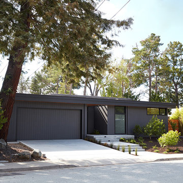
 Klopf Architecture
Klopf Architecture, Arterra Landscape Architects and Henry Calvert of Calvert Ventures Designed and built a new warm, modern, Eichler-inspired, open, indoor-outdoor home on a deeper-than-usual San Mateo Highlands property where an original Eichler house had burned to the ground.
The owners wanted multi-generational living and larger spaces than the original home offered, but all parties agreed that the house should respect the neighborhood and blend in stylistically with the other Eichlers. At first the Klopf team considered re-using what little was left of the original home and expanding on it. But after discussions with the owner and builder, all parties agreed that the last few remaining elements of the house were not practical to re-use, so Klopf Architecture designed a new home that pushes the Eichler approach in new directions.
One disadvantage of Eichler production homes is that the house designs were not optimized for each specific lot. A new custom home offered the team a chance to start over. In this case, a longer house that opens up sideways to the south fit the lot better than the original square-ish house that used to open to the rear (west). Accordingly, the Klopf team designed an L-shaped “bar” house with a large glass wall with large sliding glass doors that faces sideways instead of to the rear like a typical Eichler. This glass wall opens to a pool and landscaped yard designed by Arterra Landscape Architects.
Driving by the house, one might assume at first glance it is an Eichler because of the horizontality, the overhanging flat roof eaves, the dark gray vertical siding, and orange solid panel front door, but the house is designed for the 21st Century and is not meant to be a “Likeler.” You won't see any posts and beams in this home. Instead, the ceiling decking is a western red cedar that covers over all the beams. Like Eichlers, this cedar runs continuously from inside to out, enhancing the indoor / outdoor feeling of the house, but unlike Eichlers it conceals a cavity for lighting, wiring, and insulation. Ceilings are higher, rooms are larger and more open, the master bathroom is light-filled and more generous, with a separate tub and shower and a separate toilet compartment, and there is plenty of storage. The garage even easily fits two of today's vehicles with room to spare.
A massive 49-foot by 12-foot wall of glass and the continuity of materials from inside to outside enhance the inside-outside living concept, so the owners and their guests can flow freely from house to pool deck to BBQ to pool and back.
During construction in the rough framing stage, Klopf thought the front of the house appeared too tall even though the house had looked right in the design renderings (probably because the house is uphill from the street). So Klopf Architecture paid the framer to change the roofline from how we had designed it to be lower along the front, allowing the home to blend in better with the neighborhood. One project goal was for people driving up the street to pass the home without immediately noticing there is an "imposter" on this lot, and making that change was essential to achieve that goal.
This 2,606 square foot, 3 bedroom, 3 bathroom Eichler-inspired new house is located in San Mateo in the heart of the Silicon Valley.
Klopf Architecture Project Team: John Klopf, AIA, Klara Kevane
Landscape Architect: Arterra Landscape Architects
Contractor: Henry Calvert of Calvert Ventures
Photography ©2016 Mariko Reed
Location: San Mateo, CA
Year completed: 2016
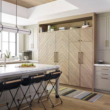
 Studio Dearborn
This expansive Victorian had tremendous historic charm but hadn’t seen a kitchen renovation since the 1950s. The homeowners wanted to take advantage of their views of the backyard and raised the roof and pushed the kitchen into the back of the house, where expansive windows could allow southern light into the kitchen all day. A warm historic gray/beige was chosen for the cabinetry, which was contrasted with character oak cabinetry on the appliance wall and bar in a modern chevron detail. Kitchen Design: Sarah Robertson, Studio Dearborn Architect: Ned Stoll, Interior finishes Tami Wassong Interiors

Sponsored
Columbus, OH

Hope Restoration & General Contracting
Columbus Design-Build, Kitchen & Bath Remodeling, Historic Renovations
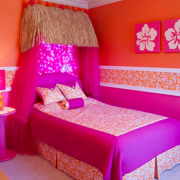
 Delaney Window Fashions LLC
When the client spoke with the Delaney Window Fashions LLC workroom designer about the creation of a unique, Hawaiian-themed child’s bedroom, the bright pink and orange paint was already in place, along with the hibiscus floral fabric border. The impetus for the additional work was the transition from a baby’s room with a crib to a little girl’s room with a full-size bed. Although the room was started, it was far from complete.
With a limited amount of the client’s floral fabric, which had subsequently been discontinued, the designer created bedding and pillows and constructed a Hawaiian-themed bed canopy with lights. The homeowner wanted the bedding to be washable but not quilted and the bed crown to be light weight. A tailored, center-pleat bed skirt was created first. The remaining fabric, along with an accent fabric was used to create a comforter, envelope and bolster pillows. The comforter was created with two mitered corners; and micro-cording was purposely added around the middle section to hide the seam.The middle section was hand tacked to secure comforter layers for laundering.
To finish the bedding, a tiki hut-inspired bed crown was created, which was challenging because the material had to be light weight. Including LED garland added a
fun and whimsical element. With child safety in mind, shirred tulle panels were attached to the back and sides of the crown. In this way, the lights were visible, but not accessible to the child.
The project was a success, and the client loves the room. The child’s lighted tiki hut bed crown provided a cozy environment for nightly bedtime stories. It made for one happy little girl!
This project was applied for a competition.
Photographer: Simona Buna
 HMH Architecture + Interiors
Photo by: Andrew Pogue Photography
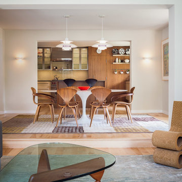
Great room - modern great room idea in Denver with white walls
Great room - modern great room idea in Denver with white walls
 Adams + Beasley Associates
Eric Roth Photography
Small minimalist l-shaped medium tone wood floor eat-in kitchen photo in Boston with an undermount sink, flat-panel cabinets, gray cabinets, granite countertops, stainless steel appliances and an island
Small minimalist l-shaped medium tone wood floor eat-in kitchen photo in Boston with an undermount sink, flat-panel cabinets, gray cabinets, granite countertops, stainless steel appliances and an island
 Thyme & Place Design LLC
When my client had to move from her company office to work at home, she set up in the dining room. Despite her best efforts, this was not the long-term solution she was looking for. My client realized she needed a dedicated space not on the main floor of the home. On one hand, having your office space right next to the kitchen is handy. On the other hand, it made separating work and home life was not that easy.
The house was a ranch. In essence, the basement would run entire length of the home. As we came down the steps, we entered a time capsule. The house was built in the 1950’s. The walls were covered with original knotty pine paneling. There was a wood burning fireplace and considering this was a basement, high ceilings. In addition, there was everything her family could not store at their own homes. As we wound though the space, I though “wow this has potential”, Eventually, after walking through the laundry room we came to a small nicely lit room. This would be the office.
My client looked at me and asked what I thought. Undoubtedly, I said, this can be a great workspace, but do you really want to walk through this basement and laundry to get here? Without reservation, my client said where do we start?
Once the design was in place, we started the renovation. The knotty pine paneling had to go. Specifically, to add some insulation and control the dampness and humidity. The laundry room wall was relocated to create a hallway to the office.
At the far end of the room, we designated a workout zone. Weights, mats, exercise bike and television are at the ready for morning or afternoon workouts. The space can be concealed by a folding screen for party time. Doors to an old closet under the stairs were relocated to the workout area for hidden storage. Now we had nice wall for a beautiful console and mirror for storage and serving during parties.
In order to add architectural details, we covered the old ugly support columns with simple recessed millwork panels. This detail created a visual division between the bar area and the seating area in front of the fireplace. The old red brick on the fireplace surround was replaced with stack stone. A mantle was made from reclaimed wood. Additional reclaimed wood floating shelves left and right of the fireplace provides decorative display while maintaining a rustic element balancing the copper end table and leather swivel rocker.
We found an amazing rug which tied all of the colors together further defining the gathering space. Russet and burnt orange became the accent color unifying each space. With a bit of whimsy, a rather unusual light fixture which looks like roots from a tree growing through the ceiling is a conversation piece.
The office space is quite and removed from the main part of the basement. There is a desk large enough for multiple screens, a small bookcase holding office supplies and a comfortable chair for conference calls. Because working from home requires many online meetings, we added a shiplap wall painted in Hale Navy to contrast with the orange fabric on the chair. We finished the décor with a painting from my client’s father. This is the background online visitors will see.
The last and best part of the renovation is the beautiful bar. My client is an avid collector of wine. She already had the EuroCave refrigerator, so I incorporated it into the design. The cabinets are painted Temptation Grey from Benjamin Moore. The counter tops are my favorite hard working quartzite Brown Fantasy. The backsplash is a combination of rustic wood and old tin ceiling like porcelain tiles. Together with the textures of the reclaimed wood and hide poofs balanced against the smooth finish of the cabinets, we created a comfortable luxury for relaxing.
There is ample storage for bottles, cans, glasses, and anything else you can think of for a great party. In addition to the wine storage, we incorporated a beverage refrigerator, an ice maker, and a sink. Floating shelves with integrated lighting illuminate the back bar. The raised height of the front bar provides the perfect wine tasting and paring spot. I especially love the pendant lights which look like wine glasses.
Finally, I selected carpet for the stairs and office. It is perfect for noise reduction. Meanwhile for the overall flooring, I specifically selected a high-performance vinyl plank floor. We often use this product as it is perfect to install on a concrete floor. It is soft to walk on, easy to clean and does not reduce the overall height of the space.

 Crisp Architects
Rob Karosis
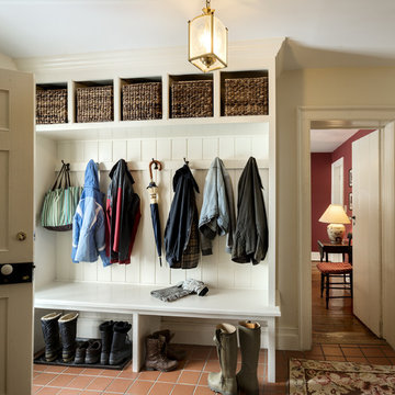
Example of a country entryway design in New York with beige walls and a white front door
Example of a country entryway design in New York with beige walls and a white front door
Sponsored
Columbus, OH
Hope Restoration & General Contracting
Columbus Design-Build, Kitchen & Bath Remodeling, Historic Renovations
 Boyce Design + Build
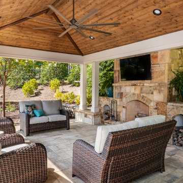
The classic style covered cabana sits poolside and houses an impressive, outdoor, stacked stone, wood burning fireplace with wood storage, mounted tv, a vaulted tongue and groove ceiling and an outdoor living room perfect for hosting family and friends.
 Thyme & Place Design LLC
When my client had to move from her company office to work at home, she set up in the dining room. Despite her best efforts, this was not the long-term solution she was looking for. My client realized she needed a dedicated space not on the main floor of the home. On one hand, having your office space right next to the kitchen is handy. On the other hand, it made separating work and home life was not that easy.
The house was a ranch. In essence, the basement would run entire length of the home. As we came down the steps, we entered a time capsule. The house was built in the 1950’s. The walls were covered with original knotty pine paneling. There was a wood burning fireplace and considering this was a basement, high ceilings. In addition, there was everything her family could not store at their own homes. As we wound though the space, I though “wow this has potential”, Eventually, after walking through the laundry room we came to a small nicely lit room. This would be the office.
My client looked at me and asked what I thought. Undoubtedly, I said, this can be a great workspace, but do you really want to walk through this basement and laundry to get here? Without reservation, my client said where do we start?
Once the design was in place, we started the renovation. The knotty pine paneling had to go. Specifically, to add some insulation and control the dampness and humidity. The laundry room wall was relocated to create a hallway to the office.
At the far end of the room, we designated a workout zone. Weights, mats, exercise bike and television are at the ready for morning or afternoon workouts. The space can be concealed by a folding screen for party time. Doors to an old closet under the stairs were relocated to the workout area for hidden storage. Now we had nice wall for a beautiful console and mirror for storage and serving during parties.
In order to add architectural details, we covered the old ugly support columns with simple recessed millwork panels. This detail created a visual division between the bar area and the seating area in front of the fireplace. The old red brick on the fireplace surround was replaced with stack stone. A mantle was made from reclaimed wood. Additional reclaimed wood floating shelves left and right of the fireplace provides decorative display while maintaining a rustic element balancing the copper end table and leather swivel rocker.
We found an amazing rug which tied all of the colors together further defining the gathering space. Russet and burnt orange became the accent color unifying each space. With a bit of whimsy, a rather unusual light fixture which looks like roots from a tree growing through the ceiling is a conversation piece.
The office space is quite and removed from the main part of the basement. There is a desk large enough for multiple screens, a small bookcase holding office supplies and a comfortable chair for conference calls. Because working from home requires many online meetings, we added a shiplap wall painted in Hale Navy to contrast with the orange fabric on the chair. We finished the décor with a painting from my client’s father. This is the background online visitors will see.
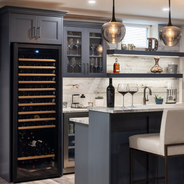
The last and best part of the renovation is the beautiful bar. My client is an avid collector of wine. She already had the EuroCave refrigerator, so I incorporated it into the design. The cabinets are painted Temptation Grey from Benjamin Moore. The counter tops are my favorite hard working quartzite Brown Fantasy. The backsplash is a combination of rustic wood and old tin ceiling like porcelain tiles. Together with the textures of the reclaimed wood and hide poofs balanced against the smooth finish of the cabinets, we created a comfortable luxury for relaxing.
There is ample storage for bottles, cans, glasses, and anything else you can think of for a great party. In addition to the wine storage, we incorporated a beverage refrigerator, an ice maker, and a sink. Floating shelves with integrated lighting illuminate the back bar. The raised height of the front bar provides the perfect wine tasting and paring spot. I especially love the pendant lights which look like wine glasses.
Finally, I selected carpet for the stairs and office. It is perfect for noise reduction. Meanwhile for the overall flooring, I specifically selected a high-performance vinyl plank floor. We often use this product as it is perfect to install on a concrete floor. It is soft to walk on, easy to clean and does not reduce the overall height of the space.
 Foster Custom Kitchens
Foster Customs Kitchens;
Photos by Robyn Wishna
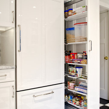
Inspiration for a mid-sized transitional marble floor kitchen remodel in New York with recessed-panel cabinets, white cabinets, paneled appliances, a farmhouse sink, white backsplash and stone slab backsplash
Inspiration for a mid-sized transitional marble floor kitchen remodel in New York with recessed-panel cabinets, white cabinets, paneled appliances, a farmhouse sink, white backsplash and stone slab backsplash
 Kenman Design Group, LLC
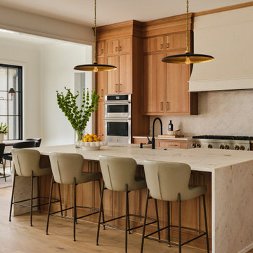
Lux on the Lake, where the kitchen flows effortlessly into everyday life. The quartzite waterfall island anchors the space with seating for four, while sculptural brass pendants draw the eye upward. Beyond, a sunlit breakfast nook framed by black steel windows invites slow mornings and lingering conversations. White oak, natural stone, and soft leather seating come together in a space designed not just for cooking, but for connection.

 Christopher @ Architects LLC
Kevin Reeves, Photographer
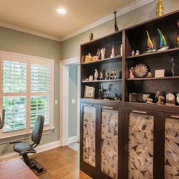
Updated kitchen with center island with chat-seating. Spigot just for dog bowl. Towel rack that can act as a grab bar. Flush white cabinetry with mosaic tile accents. Top cornice trim is actually horizontal mechanical vent. Semi-retired, art-oriented, community-oriented couple that entertain wanted a space to fit their lifestyle and needs for the next chapter in their lives. Driven by aging-in-place considerations - starting with a residential elevator - the entire home is gutted and re-purposed to create spaces to support their aesthetics and commitments. Kitchen island with a water spigot for the dog. "His" office off "Her" kitchen. Automated shades on the skylights. A hidden room behind a bookcase. Hanging pulley-system in the laundry room. Towel racks that also work as grab bars. A lot of catalyzed-finish built-in cabinetry and some window seats. Televisions on swinging wall brackets. Magnet board in the kitchen next to the stainless steel refrigerator. A lot of opportunities for locating artwork. Comfortable and bright. Cozy and stylistic. They love it.
 EB Architecture + Design
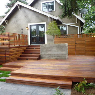
the finished new deck and outdoor space.
Deck - traditional deck idea in Portland
Deck - traditional deck idea in Portland
1